La Melancolía Tras el Cristal
ART ESP/ING
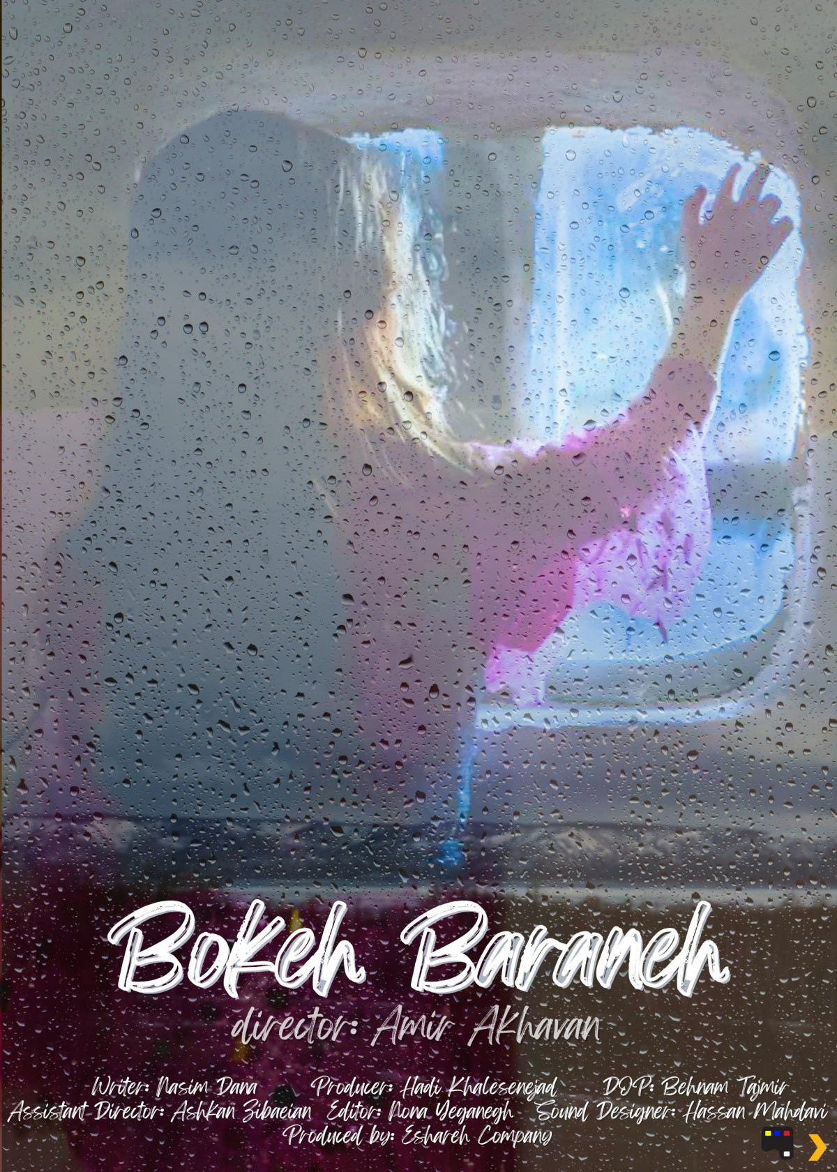
Se erige como una ventana evocadora al alma de la película, encapsulando su atmósfera y sugiriendo una narrativa introspectiva que resuena con la sensibilidad que Paradox Film suele celebrar.
La imagen central es poderosa en su sencillez: una figura femenina, apenas delineada en un suave tono rosado, parece contemplar el mundo a través de una superficie cubierta de gotas de lluvia. Este cristal empañado se convierte en el filtro principal de nuestra percepción, difuminando la realidad exterior y concentrando la atención en la soledad y la contemplación de la figura. La mano apoyada en el cristal, con los dedos ligeramente extendidos, transmite una sensación de anhelo, de conexión frustrada o quizás de una suave despedida.
La técnica del "bokeh" en el título, "Bokeh Baraneh" (que presumiblemente significa algo relacionado con el "bokeh de la lluvia"), no es casual. El efecto bokeh, caracterizado por esos círculos suaves y desenfocados de luz, se replica visualmente en las gotas de lluvia que dominan el primer plano. Esta elección estética no solo alude directamente al título, sino que también refuerza la sensación de un mundo percibido a través de una lente emocionalmente cargada. Las gotas, con sus variados tamaños y densidades, crean una textura visual rica y orgánica, casi como lágrimas silenciosas que velan la visión.
La paleta de colores es deliberadamente tenue y melancólica. Los tonos grises y azulados del fondo, insinuando un exterior sombrío, contrastan sutilmente con el tenue rosa de la figura, otorgándole un punto focal suave pero innegable. Esta elección cromática refuerza la atmósfera introspectiva y quizás incluso un matiz de fragilidad o vulnerabilidad en el personaje.
La composición es inteligente. La figura no está completamente definida, permitiendo al espectador proyectar sus propias emociones y experiencias en ella. Su posición descentrada y mirando hacia un espacio fuera del encuadre genera una sensación de misterio y anticipación. ¿Qué contempla? ¿Qué siente? El cartel no ofrece respuestas fáciles, invitando a la reflexión y a la inmersión en el universo de la película.
La tipografía utilizada para el título, "Bokeh Baraneh", con su estilo cursivo y fluido, evoca una sensación de delicadeza y quizás una cualidad poética. Su ubicación en la parte inferior, centrada y en un color blanco que resalta sobre el fondo más oscuro, le otorga prominencia sin interrumpir la fuerza visual de la imagen principal. La información adicional, dispuesta de manera discreta en la parte inferior, cumple su función informativa sin sobrecargar la estética general del cartel.
En el contexto del Concurso de Carteles de Paradox Film, conocido por su apreciación de obras que desafían las convenciones y exploran la complejidad de la condición humana, el cartel de "Bokeh Baraneh" encaja perfectamente. Su minimalismo evocador, su carga emocional implícita y su inteligente uso de la estética visual sugieren una película que prioriza la atmósfera y la introspección por encima de la acción explícita.
Este cartel no grita, susurra. No revela, sugiere. Logra capturar una esencia, un estado de ánimo, una promesa de una experiencia cinematográfica que invita a la contemplación y a la conexión emocional. Es una pieza de arte por derecho propio, que cumple su función de despertar la curiosidad y dejar una impresión duradera en el espectador. Por su sutileza, su belleza melancólica y su inteligente conexión con el posible tema de la película, considero que el cartel de "Bokeh Baraneh" es una propuesta sólida y digna de reconocimiento en el Concurso de Carteles de Paradox Film.
-------------
It stands as an evocative window into the soul of the film, encapsulating its atmosphere and suggesting an introspective narrative that resonates with the sensibility that Paradox Film often celebrates.
The central image is powerful in its simplicity: a female figure, barely outlined in a soft pink hue, appears to contemplate the world through a rain-streaked surface. This fogged glass becomes the primary filter of our perception, blurring the external reality and focusing attention on the figure's solitude and contemplation. The hand resting on the glass, with fingers slightly spread, conveys a sense of longing, of frustrated connection, or perhaps a gentle farewell.
The "bokeh" technique in the title, "Bokeh Baraneh" (which presumably means something related to "rain bokeh"), is no coincidence. The bokeh effect, characterized by those soft, out-of-focus circles of light, is visually replicated in the raindrops that dominate the foreground. This aesthetic choice not only directly alludes to the title but also reinforces the feeling of a world perceived through an emotionally charged lens. The drops, with their varied sizes and densities, create a rich and organic visual texture, almost like silent tears veiling the vision.
The color palette is deliberately muted and melancholic. The gray and bluish tones of the background, hinting at a somber exterior, subtly contrast with the soft pink of the figure, giving her a gentle but undeniable focal point. This chromatic choice reinforces the introspective atmosphere and perhaps even a nuance of fragility or vulnerability in the character.
The composition is intelligent. The figure is not fully defined, allowing the viewer to project their own emotions and experiences onto her. Her off-center position and gaze directed out of the frame generate a sense of mystery and anticipation. What is she contemplating? What is she feeling? The poster offers no easy answers, inviting reflection and immersion in the film's universe.
The typography used for the title, "Bokeh Baraneh," with its cursive and fluid style, evokes a sense of delicacy and perhaps a poetic quality. Its placement at the bottom, centered and in a white color that stands out against the darker background, gives it prominence without disrupting the visual power of the main image. The additional information, arranged discreetly at the bottom, fulfills its informative function without overwhelming the overall aesthetic of the poster.
In the context of the Paradox Film Poster Competition, known for its appreciation of works that challenge conventions and explore the complexity of the human condition, the "Bokeh Baraneh" poster fits perfectly. Its evocative minimalism, its implicit emotional weight, and its intelligent use of visual aesthetics suggest a film that prioritizes atmosphere and introspection over explicit action.
This poster does not shout, it whispers. It does not reveal, it suggests. It manages to capture an essence, a mood, a promise of a cinematic experience that invites contemplation and emotional connection. It is a piece of art in its own right, fulfilling its function of arousing curiosity and leaving a lasting impression on the viewer. For its subtlety, its melancholic beauty, and its intelligent connection to the possible theme of the film, I consider the "Bokeh Baraneh" poster to be a solid and noteworthy entry in the Paradox Film Poster Competition.