Cartel de "A Summer's End Poem
ARTE ESP / ING
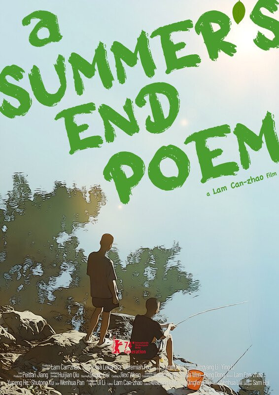
El cartel destaca por su notable evocación y sencillez, capturando una sensación de belleza efímera y contemplación sosegada que probablemente refleja la narrativa de la película
Composición y Jerarquía Visual:
- Texto Dominante: El título, "A SUMMER'S END POEM", es el elemento más prominente. Su tipografía grande, ligeramente irregular, con una estética de trazo manual, en un verde vibrante, casi luminoso, atrae inmediatamente la mirada. La disposición apilada enfatiza el aspecto de "poema", sugiriendo una cualidad lírica o introspectiva.
- Foco Central: Las dos figuras de los chicos pescando proporcionan un foco central secundario pero crucial. Su ubicación en la mitad inferior del encuadre ancla la imagen y le otorga un contexto narrativo. Están silueteados, enfatizando su forma y actividad en lugar de rasgos específicos, convirtiéndolos casi en representaciones arquetípicas de la juventud y el ocio.
- Fondo como Atmósfera: El fondo suavemente representado, que transiciona de un cielo claro a sugerencias de follaje, sirve como telón de fondo atmosférico. No está definido con nitidez, creando una cualidad onírica o similar a un recuerdo. La falta de detalle empuja el enfoque del espectador hacia los elementos del primer plano.
- Espacio Negativo: El generoso uso del espacio negativo, especialmente en la parte superior del cartel, contribuye a la sensación de quietud y amplitud. Permite que el título respire y evita que la imagen se sienta abarrotada.
Paleta de Colores:
- Verdes Terrosos: El verde dominante del título conecta visualmente con el entorno natural implícito en el fondo. Sugiere temas de naturaleza, crecimiento y quizás la fugaz vitalidad del verano. El verde está ligeramente desaturado, evitando un tono chillón y dándole una sensación vintage o nostálgica.
- Azules y Cremas Suaves: El cielo y el fondo están representados en azules y cremas suaves, creando una atmósfera gentil y brumosa. Esto contribuye a la sensación general de calidez y nostalgia.
- Figuras Silueteadas: Las siluetas oscuras de los chicos crean un fuerte contraste con el fondo más claro, haciéndolos destacar como el foco narrativo.
Tipografía:
- Estética de Trazo Manual: La calidad ligeramente irregular, de trazo manual, de la tipografía del título es significativa. Sugiere una cualidad personal, íntima e incluso infantil, alineándose con el aspecto de "poema" del título. También evita una sensación elegante y comercial, reforzando la naturaleza artística e independiente de la película.
- Ubicación y Tamaño: El tamaño y la ubicación del título son deliberados. Llama la atención sin dominar la imagen, y su disposición apilada crea un ritmo visual.
- Créditos como Subtexto: Los pequeños créditos en la parte inferior sirven como subtexto informativo, reconociendo a los cineastas y los detalles de producción. Su pequeño tamaño y ubicación no distraen de los elementos visuales principales.
Estilo Artístico e Influencias:
- Estilo de Ilustración/Grabado: El estilo visual general sugiere una estética de ilustración o grabado. Los contornos alrededor de las figuras y la representación ligeramente texturizada del fondo le dan una calidad única, artesanal. Esto podría lograrse mediante manipulación digital o una elección estilística deliberada.
- Nostálgico/Impresionista: El enfoque suave y la atmósfera brumosa evocan una sensación de nostalgia o impresionismo, sugiriendo una película que explora la memoria, los momentos fugaces y la belleza de lo cotidiano.
- Influencias Orientales: Dado el nombre del director (Lam Can-zhao), podría haber sutiles influencias de las tradiciones artísticas orientales, particularmente en el énfasis en la naturaleza y la contemplación.
Implicaciones Narrativas:
- Fin del Verano: El título en sí mismo establece inmediatamente un tema de transitoriedad y el sentimiento agridulce asociado con el final de una estación.
- Poema: El aspecto de "poema" sugiere una narrativa que es lírica, evocadora y quizás menos centrada en la trama y más en el ambiente y la emoción.
- Juventud y Ocio: La imagen de los chicos pescando establece de inmediato temas de juventud, inocencia y los simples placeres del verano. El acto de pescar también puede ser simbólico de paciencia, reflexión y el paso del tiempo.
- Contemplación: La composición y la postura de los chicos sugieren un momento de tranquila contemplación, insinuando un tono introspectivo o meditativo en la película.
Idoneidad para el Festival de Cine Paradox:
Este cartel es excepcionalmente adecuado para un festival como Paradox Film, que probablemente celebra el cine independiente, de arte y experimental. Su sensibilidad artística, tono poético y énfasis en el ambiente y los personajes se alinean perfectamente con el tipo de películas que a menudo encuentran un hogar en tales festivales. Es un cartel que promete una experiencia cinematográfica única y reflexiva.
En conclusión, este cartel es una obra maestra de la narración visual a través de la sutileza y el diseño evocador. Es una pieza de arte en sí misma que comunica eficazmente la esencia de la película y sería una entrada destacada en cualquier festival de carteles de cine.
---------
The poster is strikingly evocative in its simplicity, capturing a sense of ephemeral beauty and quiet contemplation that likely reflects the film's narrative. It avoids the bombastic and leans into the poetic, suggesting a film that prioritizes mood, character, and subtle emotional resonance over overt plot-driven action. It's a poster that whispers rather than shouts, making it stand out in a festival context where many posters compete for attention with visual noise.
Composition and Visual Hierarchy:
- Dominant Text: The title, "A SUMMER'S END POEM," is the most prominent element. Its large, slightly irregular, hand-drawn-esque lettering in a vibrant, almost luminous green immediately draws the eye. The stacked arrangement emphasizes the "poem" aspect, suggesting a lyrical or introspective quality.
- Central Focal Point: The two figures of the boys fishing provide a secondary but crucial focal point. Their placement in the lower half of the frame anchors the image and gives it a narrative context. They are silhouetted, emphasizing their form and activity rather than specific features, making them almost archetypal representations of youth and leisure.
- Background as Atmosphere: The softly rendered background, transitioning from a light sky to suggestions of foliage, serves as an atmospheric backdrop. It's not sharply defined, creating a dreamlike or memory-like quality. The lack of detail pushes the viewer's focus to the foreground elements.
- Negative Space: The generous use of negative space, especially in the upper portion of the poster, contributes to the feeling of quietude and spaciousness. It allows the title to breathe and prevents the image from feeling cluttered.
Color Palette:
- Earthy Greens: The dominant green of the title connects visually to the natural setting implied in the background. It suggests themes of nature, growth, and perhaps the fleeting vitality of summer. The green is slightly desaturated, avoiding a garish tone and lending it a vintage or nostalgic feel.
- Soft Blues and Creams: The sky and background are rendered in soft blues and creams, creating a gentle, hazy atmosphere. This contributes to the overall feeling of warmth and nostalgia.
- Silhouetted Figures: The dark silhouettes of the boys create a strong contrast against the lighter background, making them stand out as the narrative focus.
Typography:
- Hand-Drawn Aesthetic: The slightly irregular, hand-drawn quality of the title typography is significant. It suggests a personal, intimate, and perhaps even childlike quality, aligning with the "poem" aspect of the title. It also avoids a slick, commercial feel, reinforcing the artistic and independent nature of the film.
- Placement and Size: The size and placement of the title are deliberate. It commands attention without overpowering the image, and its stacked arrangement creates a visual rhythm.
- Credits as Subtext: The small credits at the bottom serve as informative subtext, acknowledging the filmmakers and production details. Their small size and placement don't distract from the main visual elements.
Artistic Style and Influences:
- Illustration/Printmaking Style: The overall visual style suggests an illustration or printmaking aesthetic. The outlines around the figures and the slightly textured rendering of the background give it a unique, handcrafted quality. This could be achieved through digital manipulation or a deliberate stylistic choice.
- Nostalgic/Impressionistic: The soft focus and hazy atmosphere evoke a sense of nostalgia or impressionism, suggesting a film that explores memory, fleeting moments, and the beauty of the everyday.
- Eastern Influences: Given the director's name (Lam Can-zhao), there might be subtle influences from Eastern art traditions, particularly in the emphasis on nature and contemplation.
Narrative Implications:
- Summer's End: The title itself immediately establishes a theme of transience and the bittersweet feeling associated with the end of a season.
- Poem: The "poem" aspect suggests a narrative that is lyrical, evocative, and perhaps less focused on plot and more on mood and emotion.
- Youth and Leisure: The image of the boys fishing immediately establishes themes of youth, innocence, and the simple pleasures of summer. The act of fishing can also be symbolic of patience, reflection, and the passage of time.
- Contemplation: The composition and the boys' posture suggest a moment of quiet contemplation, hinting at an introspective or meditative tone in the film.
Suitability for Paradox Film Festival:
This poster is exceptionally well-suited for a festival like Paradox Film, which likely celebrates independent, art-house, and experimental cinema. Its artistic sensibility, poetic tone, and emphasis on mood and character align perfectly with the kind of films that often find a home in such festivals. It's a poster that promises a unique and thoughtful cinematic experience.
In conclusion, this poster is a masterclass in visual storytelling through subtlety and evocative design. It's a piece of art in itself that effectively communicates the essence of the film and would be a standout entry in any film poster festival.