Deconstruyendo "Ens Ataquen": Un Ígneo Descenso a la Narrativa Visual
ART ESP / ING
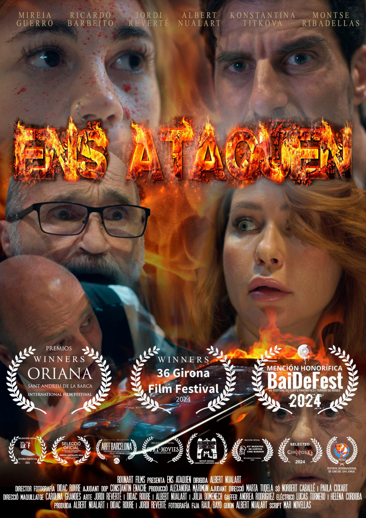
El cartel de "Ens Ataquen" presenta una propuesta visual convincente, aunque inquietante, que exige una mirada crítica y detenida. Como entrada para el concurso de carteles de Paradox Film, es una declaración audaz, que emplea hábilmente elementos de la iconografía clásica del terror, al mismo tiempo que insinúa una narrativa más matizada y contemporánea.
Composición y Color:
El aspecto más llamativo es la disposición jerárquica de los rostros. Los seis actores, enumerados en la parte superior, se presentan como cabezas desencarnadas, casi flotando en un espacio purgatorial. Esto crea una sensación inmediata de desasosiego y fragmentación. Sus expresiones son variadas, desde la aprensión hasta el terror absoluto, estableciendo una palpable sensación de amenaza.
La paleta de colores es deliberadamente discordante. El fondo azul dominante, aunque típicamente asociado con la calma, aquí se siente frío y aislante. Esta frialdad se ve violentamente interrumpida por el ardiente, casi visceral título "ENS ATAQUEN". El uso de una fuente llameante y distorsionada es un guiño directo a los tropos del terror, evocando imágenes infernales y sugiriendo una narrativa centrada en un conflicto intenso o quizás incluso fuerzas sobrenaturales. Los tonos rojos y naranjas, en marcado contraste con el azul, crean una alarma visual, captando la atención del espectador y señalando peligro.
Tipografía y Simbolismo:
La tipografía de "ENS ATAQUEN" es crucial. Su apariencia áspera, casi derretida, transmite una sensación de urgencia y destrucción. No es limpia ni elegante; es cruda y visceral, reflejando la intensidad emocional sugerida en los rostros de los actores.
La ausencia de un escenario narrativo claro, más allá de la implicación de una historia humana a través de los rostros, es notable. Esta ambigüedad permite al espectador proyectar sus propios miedos e interpretaciones en la imagen. ¿Es un thriller psicológico? ¿Una invasión de ciencia ficción? ¿Un comentario social representado metafóricamente por el fuego? El cartel deja al público en un estado de tentadora incertidumbre.
Contexto Cinematográfico e Histórico-Artístico:
El cartel se inspira en varias tradiciones cinematográficas e histórico-artísticas. Las cabezas flotantes recuerdan los retratos fragmentados de Francis Bacon, que expresan la angustia existencial y la fragilidad de la identidad humana. El uso del fuego como motivo central es un clásico recurso del terror, visto en películas desde "El Exorcista" hasta "The Burning", pero también conlleva un peso simbólico, representando la destrucción, la purificación y la pasión.
La composición general, con su énfasis en los primeros planos y la intensa expresión emocional, se alinea con el lenguaje visual del cine independiente, que a menudo busca priorizar las narrativas impulsadas por los personajes y la profundidad psicológica sobre el espectáculo.
Fortalezas y Consideraciones:
La fortaleza del cartel radica en su capacidad para evocar una poderosa respuesta emocional. Es inquietante, intrigante y memorable. Sin embargo, vale la pena considerar su accesibilidad. Si bien la ambigüedad es una fortaleza para algunos, podría alienar a los espectadores que buscan una señal de género más directa.
Conclusión:
"Ens Ataquen" es un cartel convincente que utiliza una potente combinación de elementos visuales para crear una fuerte sensación de inquietud e intriga. Es una elección audaz para el concurso de carteles de Paradox Film, que demuestra una clara comprensión de las referencias cinematográficas e histórico-artísticas al tiempo que crea su propia identidad visual distinta. Su éxito dependerá en última instancia de su capacidad para comunicar eficazmente la esencia de la película al tiempo que atrae a un público amplio. Ciertamente provoca conversación y exige ser visto.
------------------
Article: Deconstructing "Ens Ataquen": A Fiery Descent into Visual Narrative
The poster for "Ens Ataquen" presents a compelling, if unsettling, visual proposition that demands a closer, critical gaze. As an entry for the Paradox Film poster competition, it's a bold statement, one that skillfully employs elements of classic horror iconography while simultaneously hinting at a more nuanced, contemporary narrative.
Composition and Color:
The most striking aspect is the hierarchical arrangement of the faces. The six actors, listed at the top, are presented as disembodied heads, almost floating in a purgatorial space. This creates an immediate sense of unease and fragmentation. Their expressions are varied, ranging from apprehension to outright terror, establishing a palpable sense of threat.
The color palette is deliberately jarring. The dominant blue backdrop, while typically associated with calmness, here feels cold and isolating. This coolness is violently disrupted by the fiery, almost visceral "ENS ATAQUEN" title. The use of a flaming, distorted font is a direct nod to horror tropes, evoking infernal imagery and suggesting a narrative centered around intense conflict or perhaps even supernatural forces. The red and orange hues, in stark contrast to the blue, create a visual alarm, grabbing the viewer's attention and signaling danger.
Typography and Symbolism:
The typography of "ENS ATAQUEN" is crucial. Its rough, almost melted appearance conveys a sense of urgency and destruction. It's not clean or elegant; it's raw and visceral, mirroring the emotional intensity suggested in the actors' faces.
The absence of a clear narrative setting, beyond the implication of a human story through the faces, is notable. This ambiguity allows the viewer to project their own fears and interpretations onto the image. Is it a psychological thriller? A science fiction invasion? A social commentary metaphorically represented by fire? The poster leaves the audience in a state of tantalizing uncertainty.
Cinematic and Art Historical Context:
The poster draws inspiration from several cinematic and art historical traditions. The floating heads recall the fragmented portraits of Francis Bacon, expressing existential angst and the fragility of human identity. The use of fire as a central motif is a classic horror device, seen in films from "The Exorcist" to "The Burning," but it also carries symbolic weight, representing destruction, purification, and passion.
The overall composition, with its emphasis on close-ups and intense emotional expression, aligns with the visual language of independent cinema, often seeking to prioritize character-driven narratives and psychological depth over spectacle.
Strengths and Considerations:
The poster's strength lies in its ability to evoke a powerful emotional response. It's unsettling, intriguing, and memorable. However, it's worth considering its accessibility. While the ambiguity is a strength for some, it might alienate viewers seeking a more straightforward genre cue.
Conclusion:
"Ens Ataquen" is a compelling poster that utilizes a potent combination of visual elements to create a strong sense of unease and intrigue. It's a bold choice for the Paradox Film poster competition, demonstrating a clear understanding of cinematic and art historical references while carving out its own distinct visual identity. Its success will ultimately depend on its ability to effectively communicate the film's essence while engaging a broad audience. It certainly sparks conversation and demands to be seen.