Una Sinfonía Visual de Géneros y Expectativas Subvertidas
ART ESP/ING
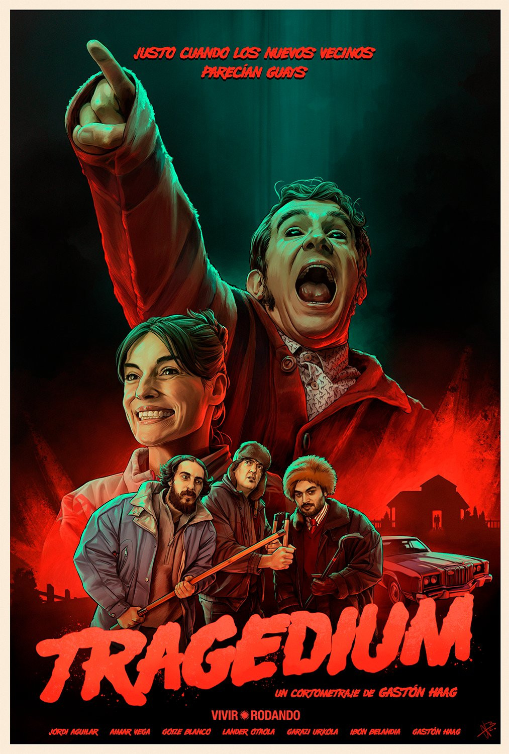
El cartel de "Tragedium", el cortometraje de Gastón Haag, se presenta como una obra que captura la atención desde el primer vistazo. No es simplemente una herramienta promocional, sino una pieza artística que adelanta la complejidad y la originalidad de la propuesta cinematográfica. En este análisis, exploraremos los elementos que lo componen y cómo contribuyen a generar una expectativa particular en el espectador.
Una Paleta Cromática que Desafía la Convención
La paleta de colores es uno de los aspectos más notables. El rojo intenso, que domina la escena, se asocia tradicionalmente con el drama, la pasión o incluso el terror. Sin embargo, su combinación con el ocre terroso y el verde neón en la figura central introduce una nota discordante, casi grotesca, que sugiere una subversión de las expectativas. Esta elección cromática podría estar anticipando la mezcla de géneros que presumiblemente encontraremos en el cortometraje, donde lo trágico se entrelaza con lo cómico o lo absurdo.
Composición y Jerarquía Narrativa
La composición del cartel establece una clara jerarquía narrativa. La figura central, con su gesto exagerado y su expresión de angustia (o quizás sorpresa), ocupa el lugar prominente. Su dedo índice apuntando hacia arriba, además de dirigir la mirada del espectador, podría simbolizar una acusación, una llamada de atención o incluso una ruptura de la cuarta pared. Los otros personajes, ubicados en la parte inferior, adoptan actitudes más contenidas, lo que sugiere una dinámica de poder o una relación compleja entre ellos.
El "Slogan" y la Ironía Narrativa
El "slogan" "Justo cuando los nuevos vecinos parecían guays" es una joya de concisión y ambigüedad. Su tono coloquial y su aparente sencillez contrastan con la grandilocuencia del título "Tragedium" y con la intensidad de la imagen. Esta disonancia lingüística podría estar insinuando la ironía narrativa que encontraremos en el cortometraje, donde las apariencias engañan y lo cotidiano se torna extraordinario.
Referencias Cinematográficas y Estéticas
El cartel parece dialogar con diversas tradiciones cinematográficas y estéticas. La tipografía del título evoca el cine de serie B de los años 70, con su estética retro y su aire descarado. La composición, con los personajes dispuestos en diferentes planos, recuerda a los carteles clásicos del cine de aventuras o de catástrofes. Sin embargo, la singularidad de la imagen y la mezcla de elementos dispares lo alejan de cualquier imitación burda, convirtiéndolo en una obra original y con personalidad propia.
El Poder de la Sugerencia
En definitiva, el cartel de "Tragedium" es un ejemplo de cómo una imagen puede condensar la esencia de una obra cinematográfica. No revela demasiado, pero sugiere lo suficiente como para despertar la curiosidad y el deseo de ver el cortometraje. Su fuerza radica en su capacidad para evocar un mundo propio, donde lo familiar se torna extraño y donde las emociones se expresan con una intensidad desbordante.
Conclusión: Un Cartel que Invita a la Exploración Cinematográfica
Como pieza para un concurso de carteles, "Tragedium" destaca por su originalidad, su fuerza visual y su capacidad para generar expectativas. No es un cartel convencional, sino una invitación a explorar un universo cinematográfico único, donde los géneros se fusionan y donde la realidad se deforma bajo la lente de la ironía y el absurdo. Su potencial para captar la atención del público y transmitir la esencia del cortometraje lo convierte en un digno contendiente para el premio.
------------------------
Analysis of the "Tragedium" Poster: A Visual Symphony of Genres and Subverted Expectations
The poster for "Tragedium," the short film by Gastón Haag, commands attention from the very first glance. It's not merely a promotional tool, but an artistic piece that foreshadows the complexity and originality of the cinematic proposal. In this analysis, we'll explore its constituent elements and how they contribute to generating a particular expectation in the viewer.
A Chromatic Palette that Defies Convention
The color palette is one of the most striking aspects. The intense red, which dominates the scene, is traditionally associated with drama, passion, or even terror. However, its combination with the earthy ochre and the neon green in the central figure introduces a discordant, almost grotesque note, suggesting a subversion of expectations. This chromatic choice could be anticipating the blend of genres that we'll presumably find in the short film, where the tragic intertwines with the comedic or the absurd.
Composition and Narrative Hierarchy
The poster's composition establishes a clear narrative hierarchy. The central figure, with its exaggerated gesture and expression of anguish (or perhaps surprise), occupies the prominent position. Its index finger pointing upwards, in addition to directing the viewer's gaze, could symbolize an accusation, a call for attention, or even a breaking of the fourth wall. The other characters, located at the bottom, adopt more restrained attitudes, suggesting a power dynamic or a complex relationship between them.
The "Slogan" and Narrative Irony
The "slogan" "Justo cuando los nuevos vecinos parecían guays" ("Just when the new neighbors seemed cool") is a gem of conciseness and ambiguity. Its colloquial tone and apparent simplicity contrast with the grandiloquence of the title "Tragedium" and the intensity of the image. This linguistic dissonance could be hinting at the narrative irony we'll encounter in the short film, where appearances deceive and the everyday becomes extraordinary.
Cinematic and Aesthetic References
The poster seems to engage in a dialogue with various cinematic and aesthetic traditions. The typography of the title evokes the B-movie cinema of the 1970s, with its retro aesthetic and its brazen air. The composition, with the characters arranged on different planes, is reminiscent of classic adventure or disaster movie posters. However, the singularity of the image and the mix of disparate elements set it apart from any crude imitation, turning it into an original work with its own personality.
The Power of Suggestion
Ultimately, the "Tragedium" poster is an example of how an image can condense the essence of a cinematic work. It doesn't reveal too much, but it suggests enough to awaken curiosity and the desire to see the short film. Its strength lies in its ability to evoke its own world, where the familiar becomes strange and where emotions are expressed with an overflowing intensity.
Conclusion: A Poster that Invites Cinematic Exploration
As a piece for a poster contest, "Tragedium" stands out for its originality, its visual power, and its ability to generate expectations. It is not a conventional poster, but an invitation to explore a unique cinematic universe, where genres merge and where reality is distorted under the lens of irony and the absurd. Its potential to capture the audience's attention and convey the essence of the short film makes it a worthy contender for the prize.